CASES
CGS
MAYARA A
VICTOR M
CASE STUDY - CGS | VIDEOMAKER / DRONE FPV
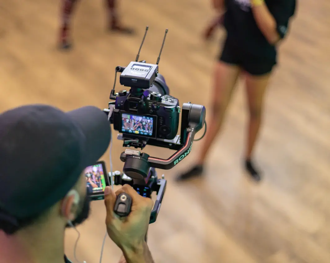
CGS is a brand that already had its name set — my production was focused entirely on building the visual identity. The client is a videomaker who, after years of hands-on camera work, expanded his practice by specializing in FPV drone piloting for footage across multiple niches. He still shoots handheld on the ground, but considerably broadened his range by mastering drone flight.
A peculiar and unusual part of this process, for me, was that the logo was born almost entirely inside a video editor, rather than a traditional design tool. It made sense — the client's own work environment became the creative environment for the identity itself.
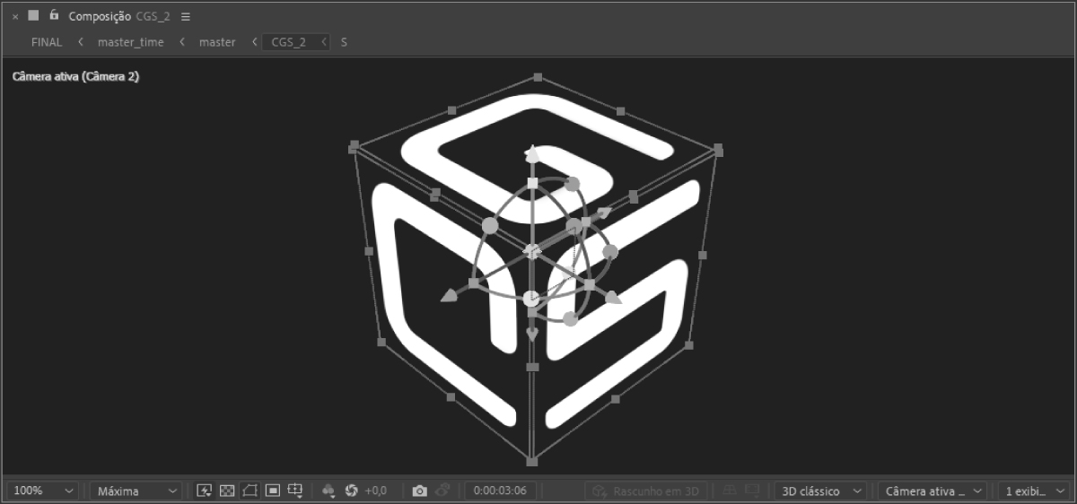
I started by drawing the letterforms in Illustrator, deliberately moving away from classic typography and kerning conventions to prioritize a sense of FLOW. As soon as I landed on a result that felt right, I moved on to the logo's motion design: every movement was built around the FREE MOBILITY a drone has in open space.
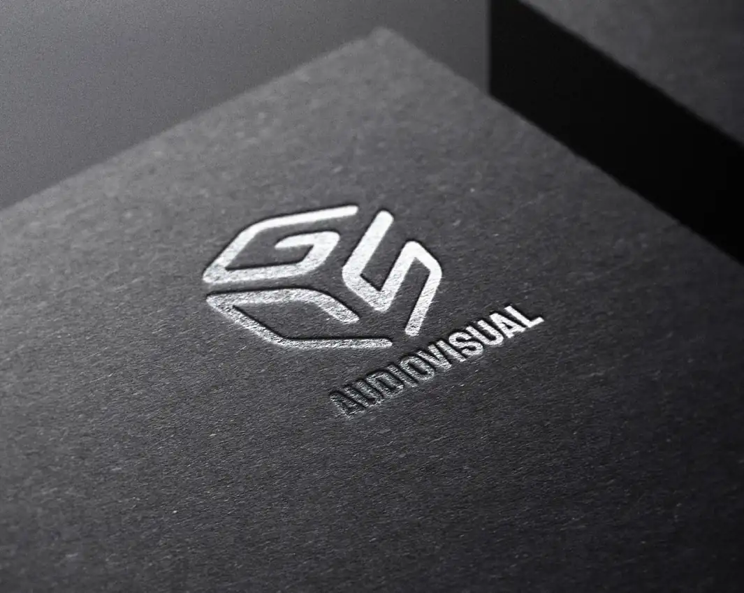
With the initial animation in place, we developed a more robust version — preserving the same core movement while expanding the idea with multiple angles, shapes, and directions. This more complete piece was designed to work as a BRAND STINGER, drawing aesthetic inspiration from classic console game intros.
We got an identity born from the client's own work environment, moving with the same freedom he finds in the air.
CASE STUDY - MAYARA ALFLEN | ADVOCACY
The challenge for the brand was to seek a personal connection, bringing the idea of a 'partnership' rather than an impersonal service provision. This had to be handled with care so as not to compromise the ideals of neutrality required by the client's profession. The approach she utilizes is SYSTEMIC LAW, heavily influenced by psychological and even philosophical systems. Based on the theories of psychotherapist Bert Hellinger (the father of Family Constellation), it emphasizes the CONCILIATION OF CONFLICTS.
Our goal: uniting a 'transgressive' idea—which is, in a way, even stigmatized within the legal environment—with an appeal to AUTHORITY for a high-end audience, without losing its intimate essence. Moving away from the standards of classic advocacy.

My creative system begins with the briefing and focuses heavily on post-briefing meetings with the client. By narrowing down the creative process, we can mature the project and align expectations DURING the development. This is THE KEY to a methodology that hits the mark in the final result without revisions, as the client feels like part of the process throughout the journey—even though the creative direction and responsibility never leave my hands.
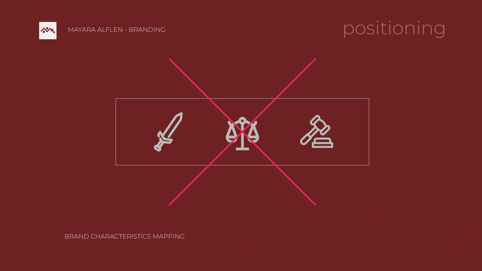
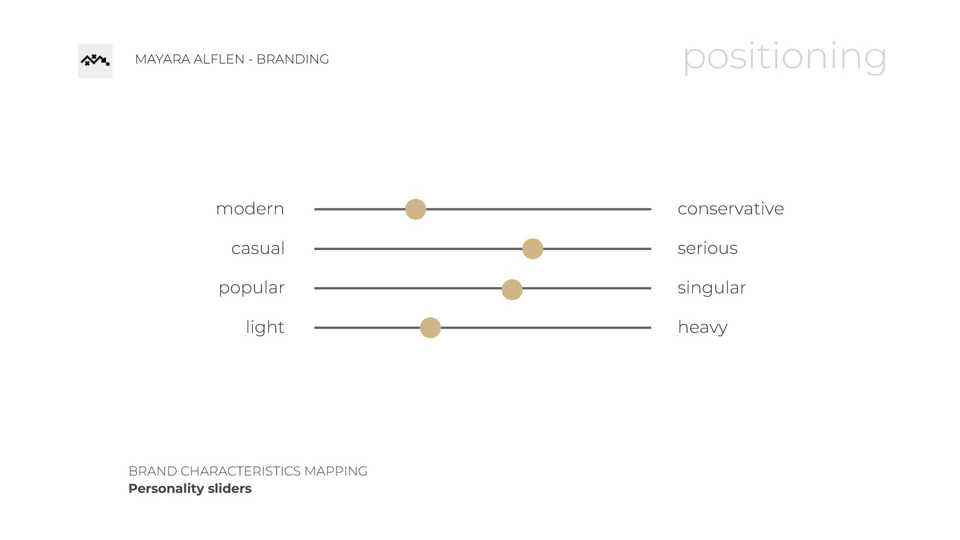
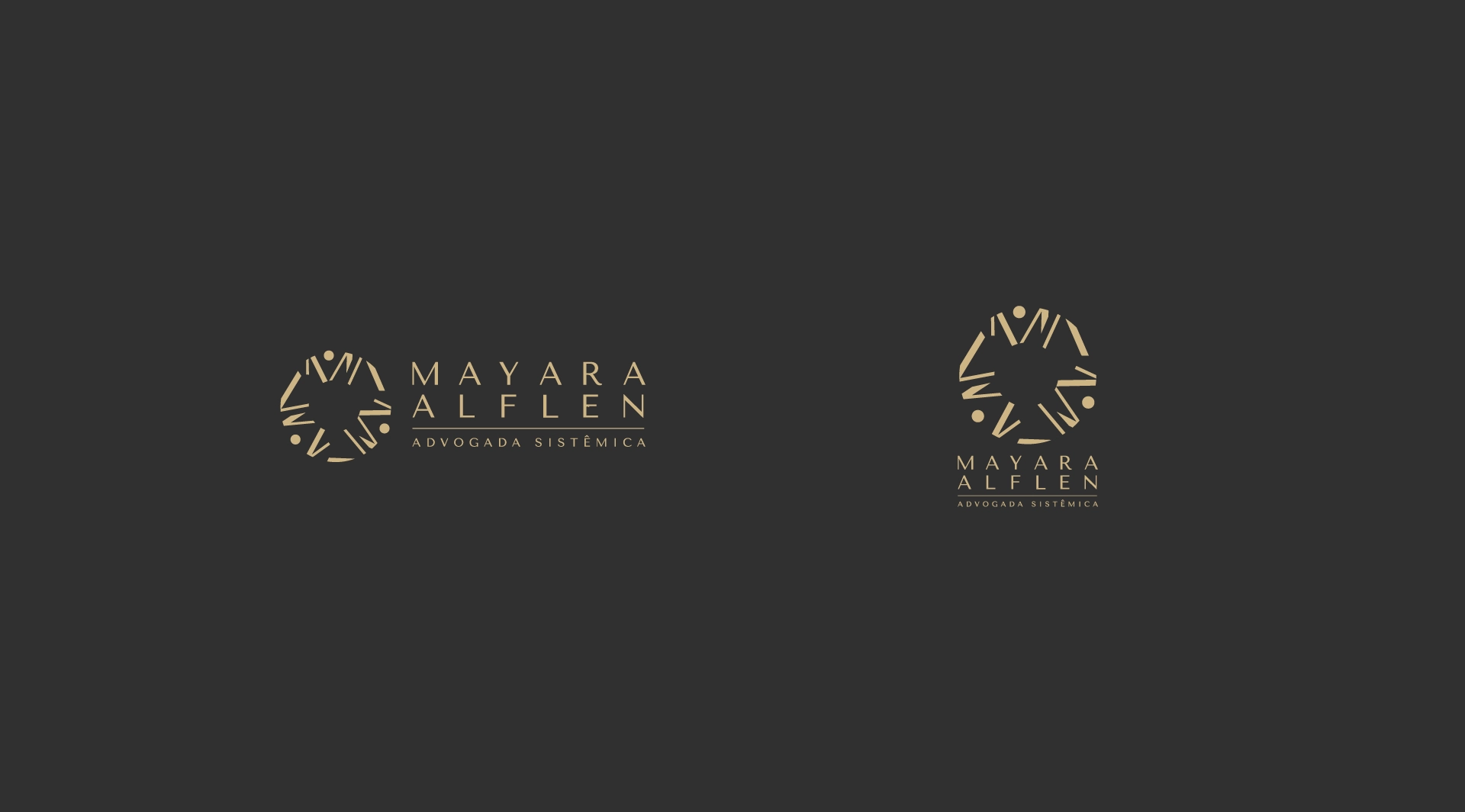
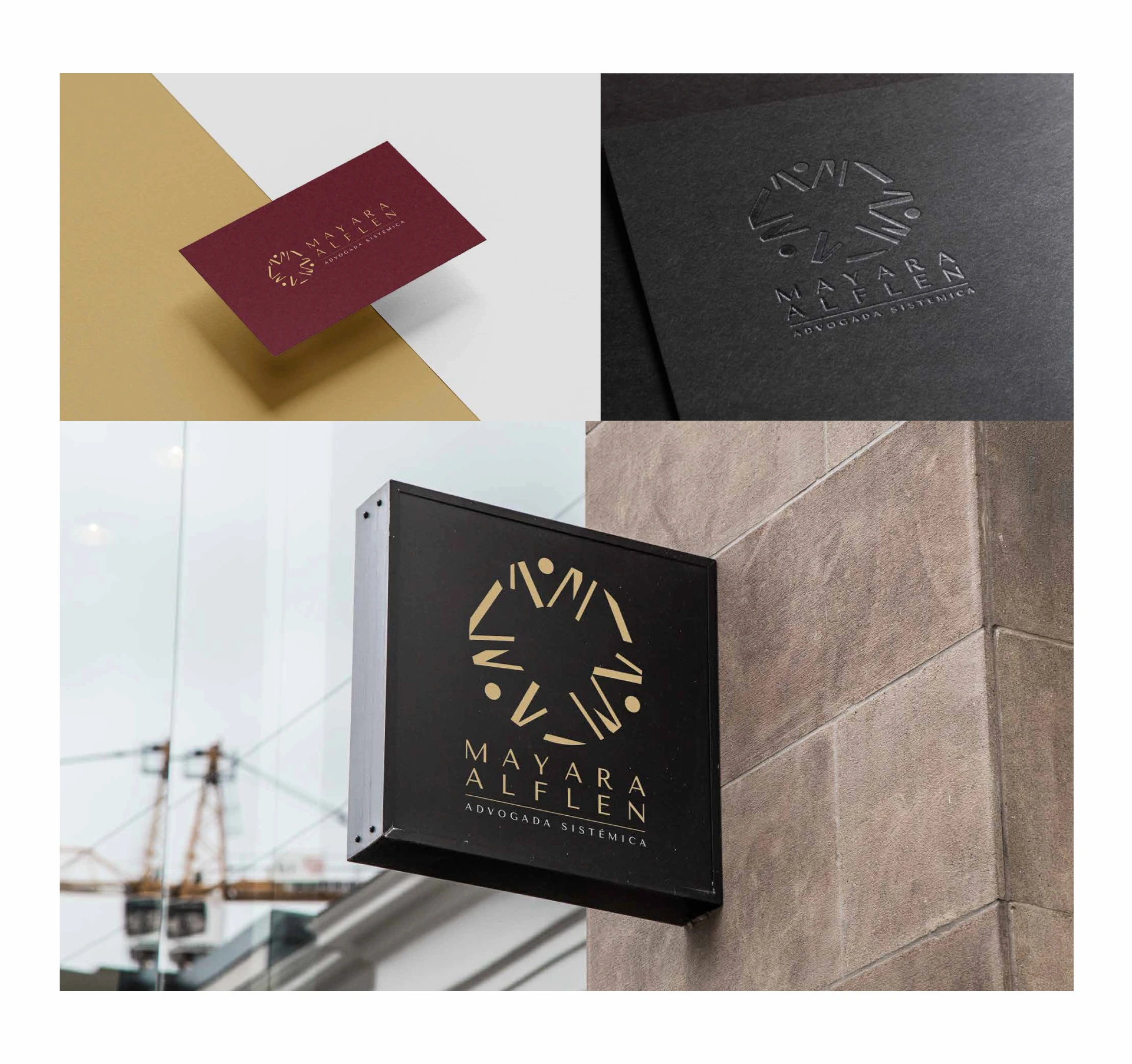
Once the meetings were held and expectations aligned, we arrived at this core idea: The Malleability of the Psyche vs. The Rigidity of the Law. An imagotype where the icon brought a certain informality, while the typography moved in the opposite direction, consolidating an equilibrium that speaks to both sides—ensuring that both can function independently as needed.
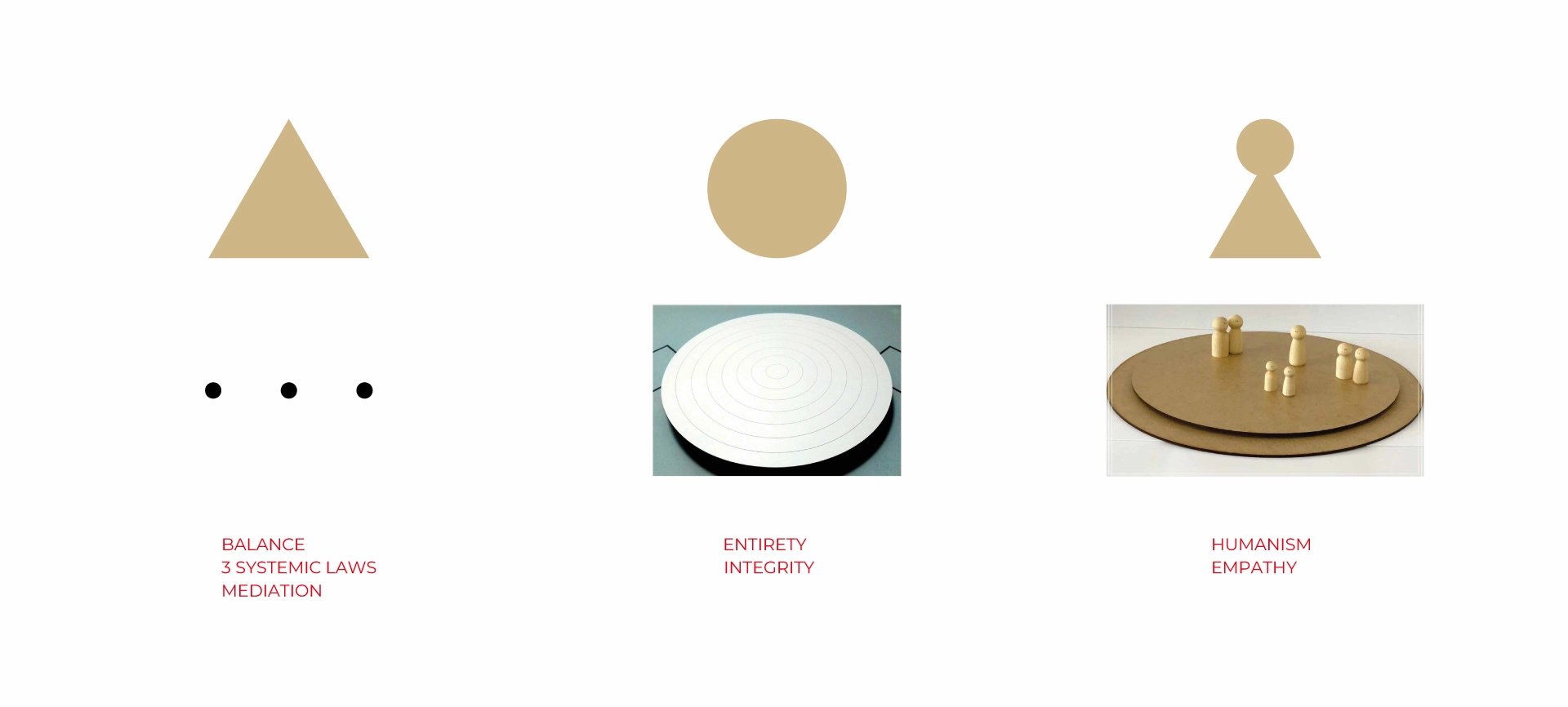
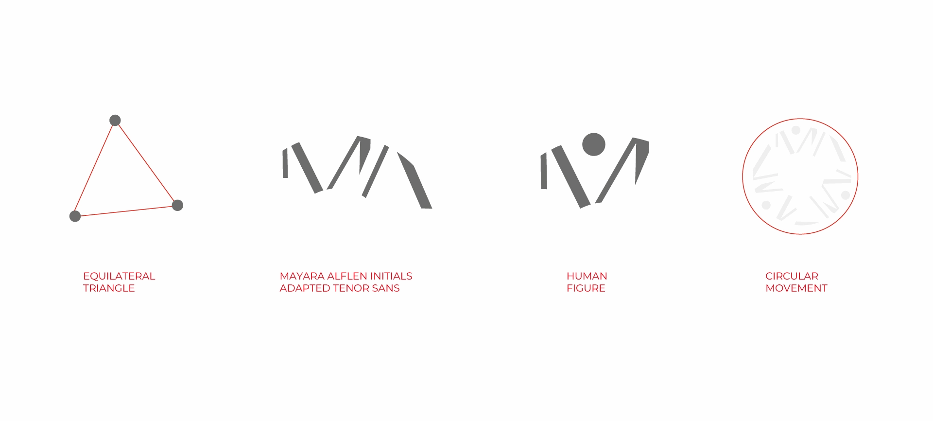
The icon - Systemic Law:
- The 3 Systemic Laws / Balance: Represented by the equilateral triangle;
- The Being in Completeness / Integrity: Reflected in the circle;
- The Humanism of the Approach: The abstract human figure.
3 parts centered on themselves reaching a mediated consensus.
The typography (client’s name + tagline) | seriousness of the legal profession;
- Discreet Serif Font;
- Perpendicular Axis;
- Modulated Strokes (movement).
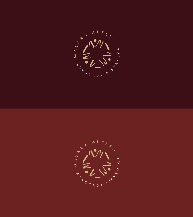
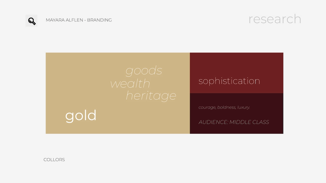
The colors bridge the connection between the high-end audience and the client’s femininity (as resquested by Mayara).
GOLD + LUXURY + FEMININITY. All colors feature low saturation, returning once again to a sense of seriousness and sobriety.
The final result: She loved it.
And best of all: The brand works.
CASE STUDY - VICTOR MENDES | PERSONAL TRAINING
Identity created for a versatile personal trainer. Victor has a classic essence in appearance and lifestyle. He prizes 'Old-school' values, yet he is not disconnected from the current needs of the profession: a reach beyond what was the focus in old gyms. There is a need for adaptation to other lifestyles that span society: A light workout and diet for women who want to focus on health and emagrecimento, without falling short of the heavy training for men who want to develop strong, robust muscles and high performance.

With the proposal to move away from 'innovative' and disruptive approaches, we opted for something classic, yet MODERN, in order not to disconnect from the current fitness environment.
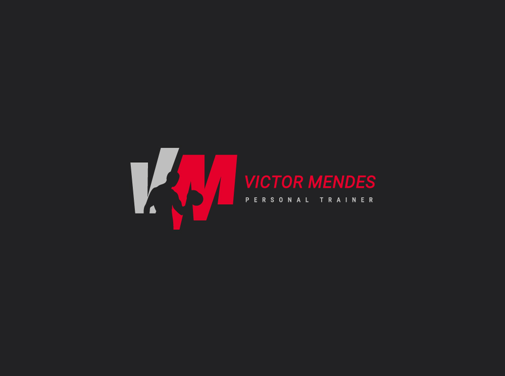
"MOVIMENTO"
During the alignment meetings, persona building, and brand tone of voice, we identified an interesting gap to connect Victor's different daily realities. MOVEMENT unites all the atmospheres where he is inserted. 'Cardio', for example, is present as a fundamental piece in any training system.
The combination between INTENSE RED and different shades of gray creates an atmosphere of controlled energy and sobriety.
Typography whit clean lines, and sans-serif design offer comfortable reading in both digital and print media. It allows for variations in weight and style, facilitating visual hierarchies.

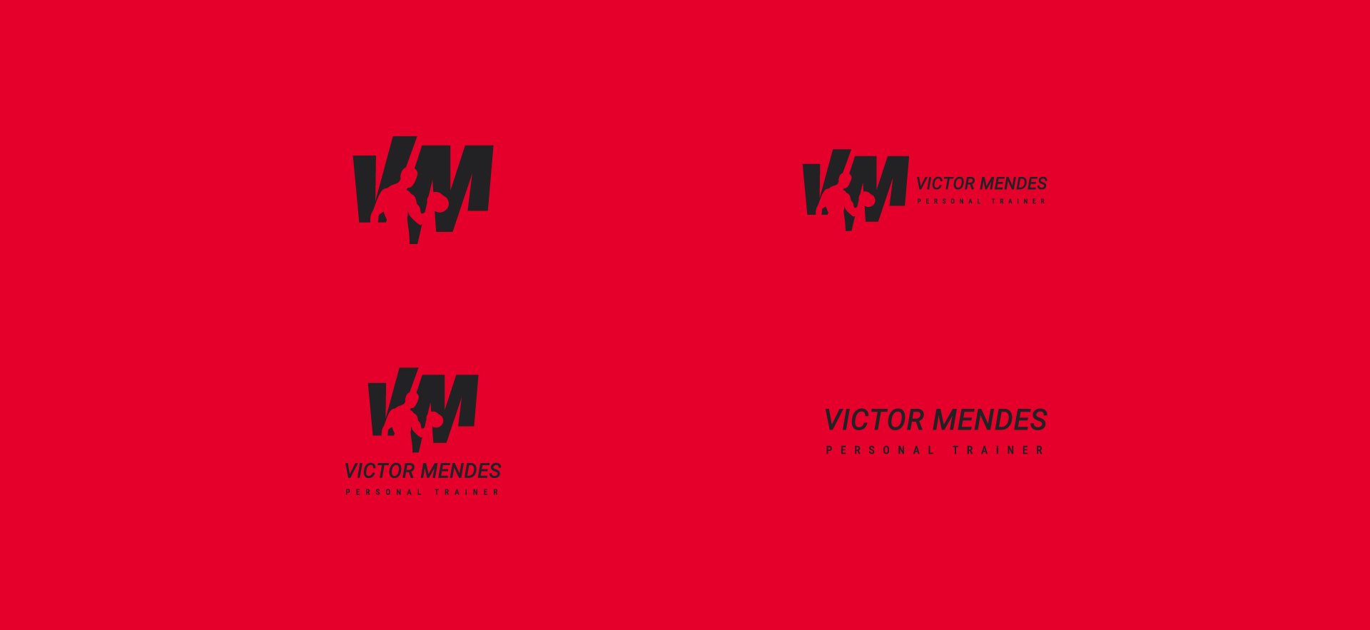
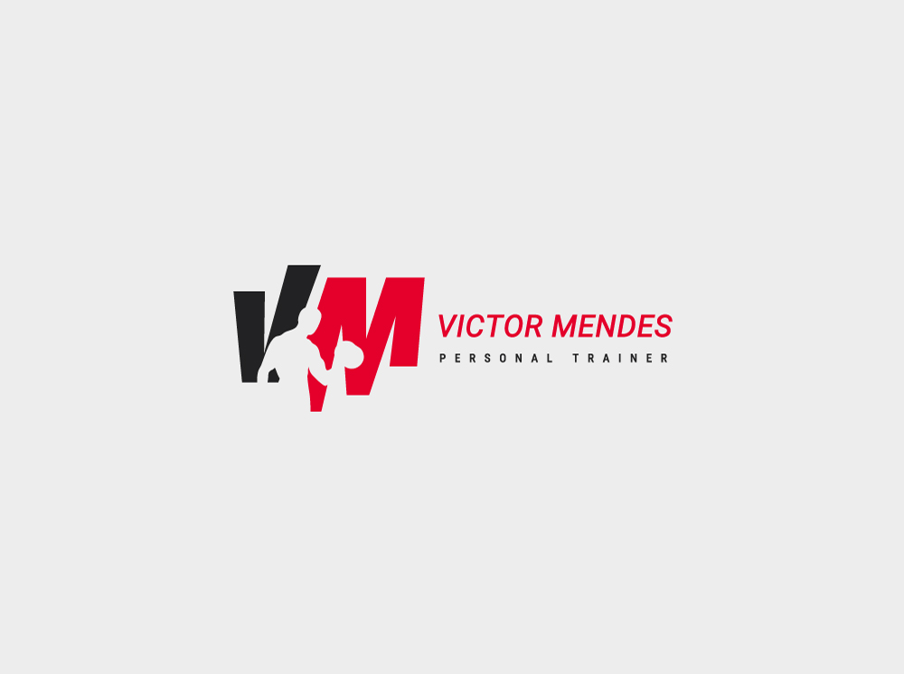
The rhythmic heartbeat is the core of this brand's aesthetics. The acronym VM is not just a monogram, but a direct reference to the rhythmic movement of an electrocardiographic tracing. At the center of the diagram, the wave movement is evidenced through the intentional alteration of the axes and the extremities of the letters, materializing the idea of vitality and constancy. The choice of italics reinforces this dynamic, adding to the movement the inclination of the 'progressive' — the student's continuous advancement. In contrast, the use of bold and a dense color palette rescues the strength and robustness inherent in Victor's work and his own aesthetics.
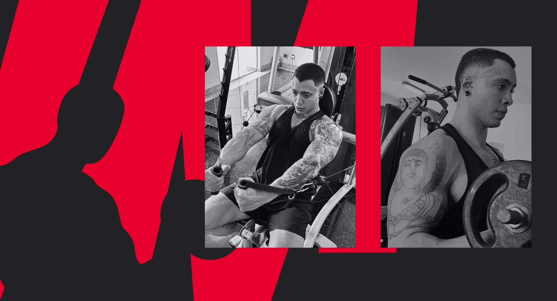
Finally, as a direct homage to the 'Old-school' spirit, the project incorporates a silhouette with characteristics faithful to Victor's, executing a bicep curl movement. This element not only values the classic bodybuilding aesthetic but also humanizes the icon, transferring the personality and authority of the mentor directly to the brand.